A brand color can look right on screen and still print differently on a sign, shirt, or brochure. That mismatch matters: consistent colors across digital and printed materials help reinforce brand recognition and create a cohesive experience. Ensuring brand color accuracy in printing takes more than choosing a shade. Teams need shared specifications and a repeatable production process.
RGB is used for digital displays, while CMYK is used for printing, so a color may shift as artwork moves from screen to press. This guide explains how ICC profiles and calibrated devices help manage those differences, why guidelines should record color values and approved references, and how proofs, test prints, and batch controls catch drift before materials reach multiple stores. You’ll learn how to set clearer expectations across print projects, including apparel and signage, so every brand touchpoint feels connected rather than close enough.
Key Takeaways
- Use device- and material-specific color profiles to help printed colors match the intended brand shade.
- Set shared color specifications and approved visual references so teams have a consistent standard across print projects.
- Use proofs and test prints to catch color shifts before materials are produced for multiple stores.
- Track production conditions and compare batches to spot inconsistencies early and protect a cohesive brand experience.
Color profiles and calibrated color spaces
ICC profiles describe how devices reproduce color, helping screens and printers work toward a shared target. sRGB is suited to digital screens, while Adobe RGB offers a broader gamut. The right setup depends on the artwork and print process.
Spectrophotometer Calibration
A spectrophotometer measures printed color patches against a known reference, giving production teams useful data for color matching. It can reveal shifts between the target and a printed sample before more pieces are produced. No single Delta E tolerance suits every print job: acceptable variation depends on the agreed target, process, and material. Set the tolerance using the approved color reference.
Printer Tools and Software
Printer calibration tools and color-management software adjust device output using ICC profiles suited to the printer and substrate. Calibrate the monitor and printer, then use soft proofing to preview likely print colors before production. Profiles can help devices reproduce color consistently, but they cannot account for every effect of specialized substrates, such as plastic. Suitable tools support more reliable matching across materials.
Press Calibration and Quality Control
Press calibration means checking and adjusting production conditions so printed colors stay close to the approved target. During a run, teams can measure color control strips and inspect ink density, paper alignment, and press conditions. A contract proof is a color proof approved as the reference for production. Review it under consistent lighting before the run, then compare test prints with that reference. For branded apparel, screen printing production also needs attention to the garment substrate.
RGB and HEX to CMYK Conversion
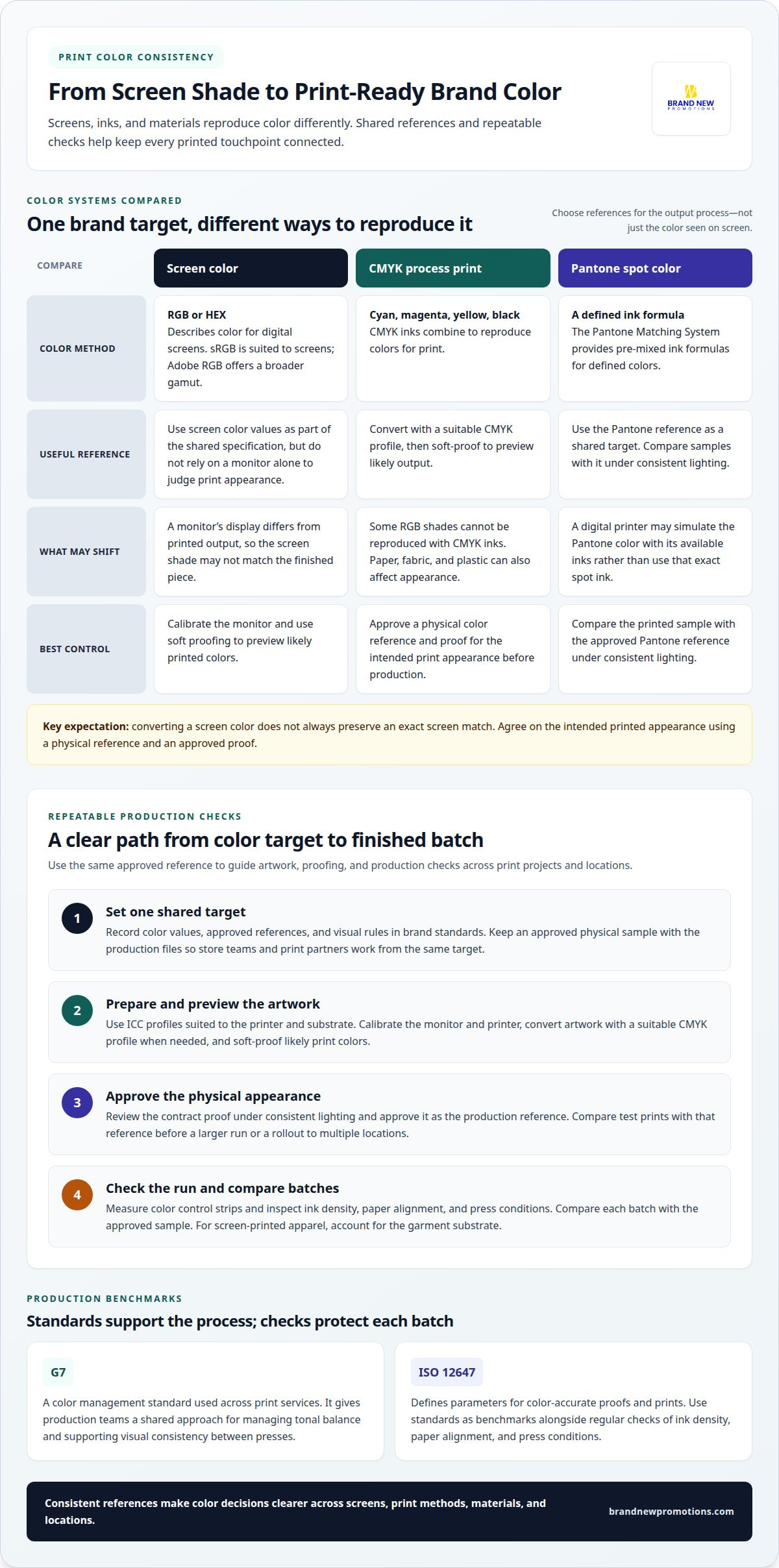
RGB and HEX describe screen colors, while CMYK describes colors made for printing with cyan, magenta, yellow, and black inks. Convert artwork using a suitable CMYK profile, then soft-proof it to see how the printer’s gamut may affect its appearance. Some RGB shades cannot be reproduced with CMYK inks, so conversion will not always preserve an exact screen match. Compare the proof with a physical color reference and approve the intended print appearance before production.
What Is Color Consistency and Why Does It Matter?
Color consistency means a brand’s colors appear similar across screens, print methods, and materials. It matters because recognizable colors help create a cohesive experience across printed materials.
Matching Colors Across Processes and Substrates
Matching colors across print processes means allowing for how each method and material affects the final appearance. A shade on coated paper may look different on fabric or plastic because inks and surfaces interact differently. Colors can also vary between digital and offset printing. For a storefront rollout, matching signs across locations depends on using consistent references and accounting for each substrate, not simply reusing one artwork file.
Pantone Spot Colors and CMYK
The Pantone Matching System (PMS) is an industry-standard guide that provides pre-mixed ink formulas for defined colors. A Pantone spot color uses a specific ink, while CMYK combines cyan, magenta, yellow, and black. Spot colors can help maintain a defined shade across materials; CMYK reproduces colors using process inks. Neither method has a universal cost advantage. Pantone matching and press proofs have no single standard price: costs depend on the print method, ink setup, substrate, run size, and proof requirements, and are provided after a quote request.
Pantone Matching in Digital Printing
In digital printing, Pantone references give the team a shared target, but the printer may simulate that color with available inks. Software and visual checks help align digital output with other print methods, especially when a project combines digital and offset work. Compare a digital sample with the approved Pantone reference under consistent lighting. This sets clearer expectations before producing materials for multiple locations.
Color Variation Across Printers and Devices
Variation occurs because devices, inks, paper brightness, lighting, and substrate absorption affect how colors appear. Two printers can produce different results from the same file, while changes in press conditions can shift later runs. A monitor’s display also differs from printed output. Keep a physical approved color reference with production files, and compare samples under similar lighting. To plan a print project with consistent references, get started with your project.
Color consistency across stores and print batches
Store rollouts need shared color standards and repeatable production checks. A sample approved for one location gives teams a reference for later batches.
Brand Standards for Consistent Colors
Brand standards document the color values, approved references, and visual rules used across locations. They help store teams and print partners work from the same target instead of relying on screen appearance or memory. Include the intended color values and an approved physical sample in the production files. For a signage rollout, compare samples from each batch with that reference before distribution. This gives teams a clear basis for spotting differences and deciding whether adjustments are needed.
G7 and Print Consistency
G7 is a color management standard used across a range of print services to support consistent output. It began with halftone laminate proofing systems and now applies to broader print work. G7 gives production teams a shared approach for managing tonal balance, supporting visual consistency between presses. ISO 12647 also defines parameters for color-accurate proofs and prints. These standards act as benchmarks, while regular checks of ink density, paper alignment, and press conditions help control each batch.
Color Consistency and Brand Integrity
Color consistency supports brand integrity by keeping the visual identity recognizable across locations and materials. If a printed sign, brochure, or display varies noticeably from the approved brand color, the overall experience may feel less cohesive. For multi-store campaigns, schedule test prints and compare them with the approved reference before a full run. Keep records of samples and production adjustments so future batches can use the same target. Consistent materials help create a connected experience at every store.
Brand guidelines for print colors and visual elements
Artwork files preserve brand colors best when they include clear color specifications, use the intended print dimensions, and suit the production process. Keep a master file and provide the print partner with color values, the approved logo, and the intended substrate. A practical step in ensuring brand color accuracy in printing is giving every production partner the same current reference.
A useful guideline turns brand identity into a repeatable production reference. It should cover more than a logo’s main color. Record how colors, type, spacing, and logo variations should appear on signs, apparel, and other printed materials. Include approved values for digital and print use, plus a physical reference when precise reproduction matters. This gives designers and production teams a shared standard.
- Color specifications: Record approved values and identify the intended print use, so teams don’t substitute an approximate shade.
- Artwork detail: Supply graphics at their intended print dimensions. For Photoshop print graphics, 300 PPI is a useful resolution target; avoid enlarging low-resolution files, which can look pixelated.
- Visual rules: Document logo placement, clear space, fonts, and approved variations. A storefront sign and branded table cover should feel like the same identity.
Calibration and color management should support these standards, not replace them. A profile helps devices handle color, while the substrate still affects the result. For example, artwork printed on fabric may look different from the same design on paper. Note the intended material and use a profile suited to the device and substrate. Soft proofing can also reveal color concerns before production.
For teams ensuring brand color accuracy in printing across locations, clear files and practical specifications help maintain a consistent look. Review guidelines whenever the identity changes or a new application is added. A print partner can use these standards to reproduce the intended appearance across materials. Start planning a print project around the colors and applications your brand needs.
BRAND NEW Promotions | Strategic Branding & Promotional Marketing Partner: graphic design & branding services
BRAND NEW Promotions, a strategic branding and promotional marketing partner in North Texas, provides graphic design & branding services to help turn color standards into clear, production-ready brand materials. This can be useful when your team is preparing new artwork, refreshing brand guidelines, or coordinating print pieces across multiple locations.
Share your approved color references, artwork, and intended materials so the design reflects your brand identity. A consistent visual system connects print pieces with promotional products and promotional marketing, while embroidery can bring the same identity to apparel. Each process and substrate affects how colors appear, so clear expectations help teams review proofs and agree on the intended result.
If you’re planning branded materials, contact BRAND NEW Promotions to discuss your project and get support with the design process.
Make your next print project a stronger brand touchpoint
Consistent color is more than a production detail. It helps people recognize your organization and experience the same visual identity at every location. A reliable approach to ensuring brand color accuracy in printing starts with a clear decision: what should your audience notice, remember, and feel when they see your materials?
Use that goal to guide your next project. Bring your brand standards, artwork, and intended applications together before production begins. A coordinated plan can help keep new materials aligned with your identity and make each touchpoint feel intentional, from a store display to apparel for your team.
When you’re ready to shape that plan, contact BRAND NEW Promotions to get started. Share what you’re creating and where it will appear, and take the next step toward a more recognizable, connected brand experience.
Frequently Asked Questions
What is color management?
Color management coordinates color across design screens, printers, and materials. It helps teams make informed decisions when a screen preview and printed sample differ. For example, a designer can compare a soft proof with a physical proof before approving a campaign. This gives everyone handling the artwork a practical reference instead of relying on individual screen settings.
Why do colors look different in print than on a computer?
Computer screens create color with light, while printed materials use ink or other colorants on a surface. RGB screens can display shades that CMYK printing cannot reproduce exactly. Screen brightness and room lighting also affect how a color appears. For a fair comparison, view a print under consistent lighting and avoid judging its color beside a bright, uncalibrated display.
How do you ensure brand colors print accurately?
Start with one approved color reference and keep it with the project artwork. Match the file to the intended printing method and material, then review a physical proof before approving production. For an organization in North Texas coordinating several locations, record approval decisions and share the same reference with each team. This keeps changes traceable and helps prevent informal color substitutions.
What are ICC color profiles, and which profiles should printers use?
ICC profiles describe how a device reproduces color, helping translate color information between screens and printers. Printers should use profiles suited to the specific printer and substrate, rather than treating one profile as right for every job. Designers may use sRGB for screen work or Adobe RGB for a broader color gamut. The production setup and material guide the choice of print profile.
How do paper type, coating, and finish affect printed brand colors?
Paper type and surface finish affect how ink appears because brightness, texture, and ink absorption vary. A color on coated stock may look sharper or more vivid than the same ink on uncoated paper. A glossy finish can also change how light reflects from the surface. Compare a sample on the intended stock, since a screen preview cannot show these material effects.
How do printers measure color accuracy with a spectrophotometer and Delta E?
A spectrophotometer reads color from a printed sample and compares the measurement with a chosen reference. Delta E expresses the difference between those colors: a smaller value indicates a closer match. The reading helps production teams spot shifts and make adjustments. Agree on the reference and acceptable variation for the project before reviewing measurements, since different brand colors and applications have different priorities.